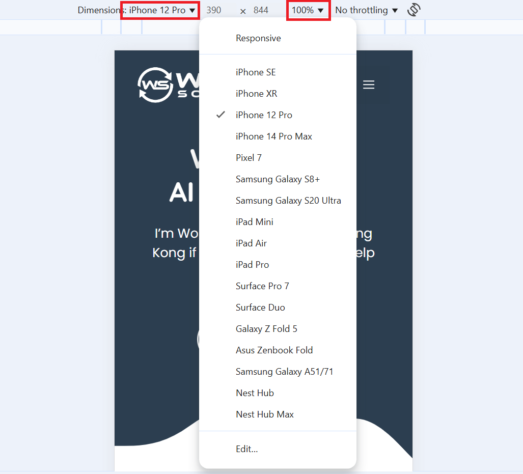
When you get a new website, you want to make sure it looks good on all screen sizes. Now, you won’t of course have 20-30 devices with varying screen sizes in your office or at home. But there’s a quicker and easier way to do that:
Chrome
When you open Chrome and then click F12, you’ll see what is called the “Developer Tools”. If that doesn’t work, you can also try “CTRL + SHIFT + i or go to the three dots on the right top, then to “More Tools” and “Developer Tools”.

In the left top corner of the developer tools, you’ll see an icon with a desktop and a mobile screen. Click that to get to the tool we need.

Here you can then click on the device next to “Dimensions” and pick whatever device you want to test. Always make sure that the zoom is at 100% so you can see the actual size of the screen.
This will then allow you to test the website for that screen. This allows you to have almost the same experience as on the actual device. Some things like different browsers (Safari vs. Chrome) might still make the website look slightly different, but 98% of errors you should be able to catch with this method.

To leave this mode, simply click on the screen icon again.
Mozilla/Firefox
In Mozilla, this tool is called “Web Developer Tools” and you can get there exactly the same way as in Chrome.

The icon looks like this and is situated at the right top. The actual tool works very similar to Chrome, so no need to go into it in too much detail here.
Conclusion
This is a great way to test either the website you did yourself or that has been delivered to you. You don’t have to use all screen sizes, but make sure to test 1-2 mobile phones (one small, one big) and at least 1 tablet to get a rough idea whether or not your website works as it should.
